Social media, SMS, search, and email—what is the right marketing channel to reach your audience? Each channel has its own strengths and weaknesses, tailored to your specific needs and goals.
So, if you’re looking to increase your engagement —email newsletters are still your best bet. Yes, good old-fashioned email newsletters!
But how do you choose the right format for your newsletter to ensure your email campaigns hit the mark? We will answer this question together, but until then, grab a snack 🍪 your favorite drink ☕, and let’s create your next great newsletter!
Why Does Email Newsletter Formatting Matter?
The newsletter content is what delivers your message and adds value to your customers, no doubt, but there’s a lot more that goes into the email formatting, especially in this age of short attention spans, where you need a layout that grabs attention and keeps readers hooked right from the start.
And needless to say, poorly formatted emails can trigger spam filters, hurting your email deliverability and reducing the chances of your message being seen.
Need some more reasons why email newsletter formatting matters? We’ve got you covered!
Your first impression
What’s the first thing that grabs your reader’s attention when they hit the open button? The format of the newsletter, of course! The design and layout speak volumes about the quality of your emails and your brand.
A neat, well-structured format is the biggest hook you can use to draw readers in before they jump into your content.
Subscribers engagement
You could say that a proper email newsletter formatting doesn’t impact subscriber engagement and we can agree but then we’d both be lying! In fact, according to recent research conducted by HubSpot, well-balanced newsletters containing visual and text elements consistently perform better.
The more engaged your subscribers are, the easier it is to build a real connection and keep them from hitting ‘unsubscribe.
What Are The Main Components of Your Email Newsletter?
Let’s dissect the building blocks of an email newsletter and explore the essential elements that work together to get your subscriber’s undivided attention. We’ll put real email newsletters under the microscope, and dissect the ins and outs.
The Header
The header is the showcase of your email, so it needs to hook the reader right away. We’ll give you some ideas to spark your creativity and help you create an engaging header.
Let’s jump into it.
Let’s stick to our header example from Raycast to better explain the role and objective of each element included in the header.
Subject line and pre-header text
The subject line and pre-header are make-or-break factors for email open rates, and it’s not really hard to see why! This very brief content should convey what your newsletter is about and entice readers to open it.
As you can see with Raycast’s subject line, they’ve used a catchy emoji at the beginning, and no it’s not just for fun. Selzy says subject lines with emojis perform 60% better than those without.
Of course, this isn’t a one-size-fits-all trick. You’ll have to test the waters to see what resonates best with your audience.
The logo
Position your company logo in the center of the email header (just like Raycast did) so it’s immediately visible when the recipient opens the email. Make it large enough to catch their eye and reinforce your brand recognition.
Add links
Don’t forget also to include navigation links in your email header, as this gives your subscribers quick access to important parts of your website, like blog posts, resources, or latest updates.
Main Body
Now that you know what goes into the header, here comes the fun part!
The main body is the section where you can get creative with formatting elements to draw more attention and, most importantly, more engagement.
Produce skimmable content
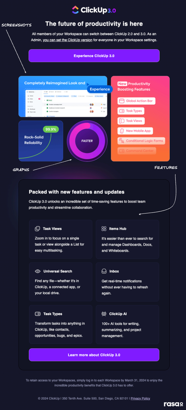
You can’t just throw content into the email without considering its scannability. Take ClickUp, for example—they keep their newsletter formatting clean and easily digestible for their readers.
They started with some graphs and screenshots, then laid out features side by side, which makes it a no-sweat for their subscribers to quickly skim through the key points of their email content.
Add graphics and videos
Continuing with our examples of ClickUp, which also embeds engaging videos in the body of their email newsletters. Why share videos via email, you ask? This practice will allow them (or you when you implement it) to create very strong bonds with their audience by giving them a behind-the-scenes look at the brand.
But that’s not the only reason; some updates and releases are so impactful that words alone can’t do them justice. With more dynamic content, you can add an extra layer of engagement.
Make a consistent choice of background color and fonts
Don’t reinvent the wheel using flashy background colors or weird fonts that don’t match your brand. ClickUp got it right by sticking with fonts and colors that pair well with their logo. Just do like ClickUp 🤷
Can you use different background colors and fonts sometimes? Absolutely. But save these changes for special occasions or events.
Integrate interactive elements
While content is perfect for engaging your subscribers, you can do better. Why not add interactive elements?
When you address some industry-related trends, reports, or product updates, your audience will definitely need some more help to grasp the information. Interactive elements to the rescue!
You can add graphs, animations, charts, illustrations, screenshots—pretty much any visual. It goes without saying that all your visuals in the email should match your brand color palette to reinforce your identity and keep your brand looking cohesive.
You can also add a button that takes your readers straight to a chatbot (yes, a chatbot!). It’s a fantastic way to offer real-time help, answer questions, and guide them through your content.
Footer
Moving to our last component which is the footer. So let’s hop ahead to see how you can wrap up your email newsletter and guide your readers to your other channels.
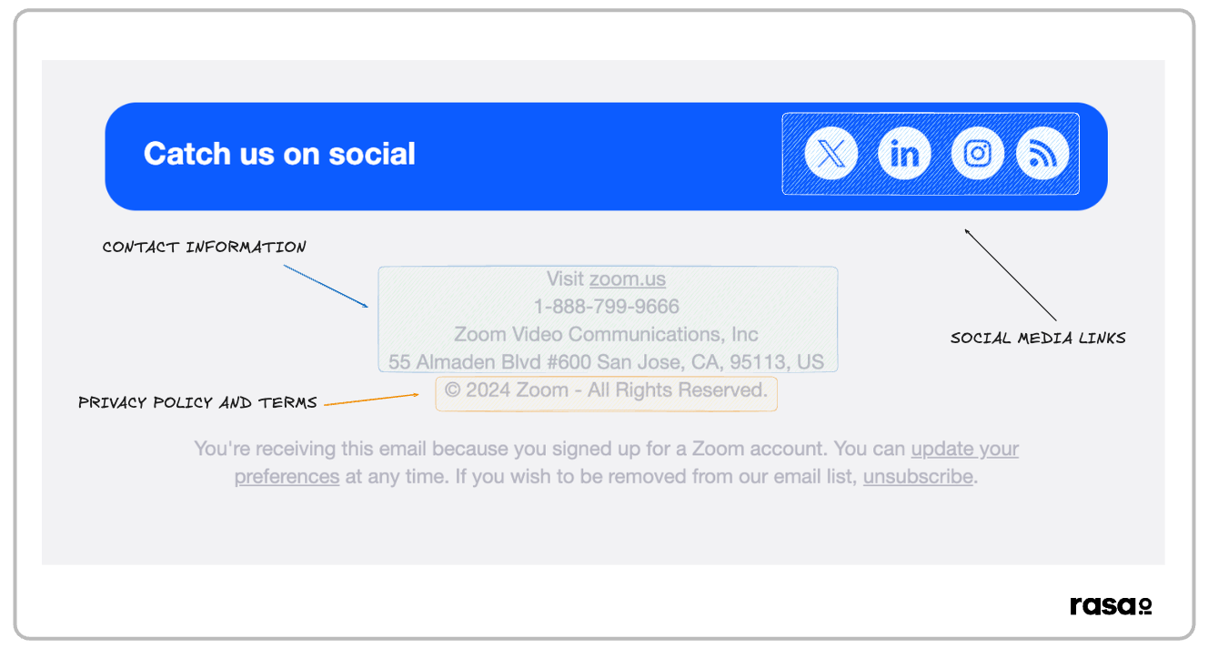
Let’s start with an example to illustrate the key elements that the footer should contain.
When you take a look at this footer of the Zoom email newsletter, you can observe social media links, contact information, as well as the company’s privacy policy.
Inserting social media links
If you’re a business looking to increase visibility and brand awareness (and who isn’t?), sharing social media links in your email footer is a very easy way to guide subscribers to the platforms where they can interact and engage with you.
It’s no coincidence that around 85% of marketing professionals worldwide included their company’s social media links in email footers in 2023.
Sharing your contact information
Your work doesn’t end with adding your social media profile; you should also share your contact information. Not only does this practice build trust with your new subscribers, but it also keeps your business compliant with email marketing regulations.
Mentioning the privacy policies of your company
People appreciate transparency, so it’s highly recommended to communicate your terms and privacy policy and explain to them how their data is being used.
Better yet! Including your privacy policy in the email footer shows you’re a responsible brand and keeps you compliant with regulations like GDPR.
Final Thoughts
And thus, we reach the end of it – the blog post, we mean, not email newsletter formatting!
Is your creative battery recharged yet? You’ve got our best email formatting tips —now go create that killer email newsletter! Go ahead, start your email campaigns, and inspire those subscribers!
Depending upon your niche, you can create the appropriate email newsletter formatting and personalize your newsletter content. And it’s not as tough as you think. rasa.io is one tool that can help you do that without missing a beat. Give it a shot! It’s just a click away!
Thanks for reading till the end 👋
Amine Boussassi is an SEO content writer who has been featured on big names like ActiveCampaign and ClickUp, and Flippa. He is enthusiastic about the SaaS world, no-code solutions, project management tools, and everything in between. His overarching mission revolves around empowering companies to achieve high rankings on Google.
Find me on LinkedIn.


