Want to drive more email subscribers to your higher ed newsletter? As a key component of the marketing funnel, your website is a natural tool to help you do so.
The best college websites and higher ed institutions attract email subscribers with eye-catching calls to action (CTAs), compelling copy, and enticing value propositions. Is your website poised to do the same? If not, here are four helpful tips for effectively promoting your email newsletter on your site.
1. Optimize your signup landing page for driving conversions
Your website should feature a dedicated landing page where visitors can register for your email newsletter. Amongst all the tools your organization can use to share your newsletter signup form, landing pages have the highest signup rate, at 23%.
Use these strategies to optimize your landing page so that it drives conversions:
- Emphasize the benefits. Research shows that 67% of people already feel overwhelmed by their email inboxes. What will subscribers gain from adding your email newsletter to the mix? Your landing page should convey the benefits subscribers will receive by signing up for your newsletter, whether they include access to exclusive event opportunities or personalized emails from your university’s president.
- Incorporate social proof. Social proof is a psychological phenomenon in which people imitate the actions of others in a given situation. According to a Nielsen study, 92% of people trust recommendations from people they know, and 70% trust consumer opinions posted online. Incorporate social proof into your newsletter landing page by including testimonials from real email subscribers. For example, you could include photos of subscribers, quotes, and statistics in your CTAs, such as “Join the 78% of alumni who are part of our digital community.”
- Write succinctly. Keep your newsletter description brief and punchy. You may even name your email newsletter to draw attention. Review our newsletter naming guide for tips and best practices to develop a catchy name.
- Make the form as simple as possible. The newsletter signup form itself should be as straightforward and easy to fill out as possible. One study found that forms with just three fields are the highest converting. Only ask for necessary information, like full names and email addresses.
- Optimize the call to action. To drive conversions, make your newsletter signup form’s “submit” button more creative and engaging. Instead of saying something simple like “Subscribe,” try mixing up the phrasing with options like “Join the Club” or “Sign Me Up.”
You should also brand your landing page to your university to promote visual cohesion across your website, including your logo, colors, and typography.
Additionally, ensure the form is accessible to all audience members. Form labels should be descriptive enough so users know what information you’re asking them to provide. Your form should also be keyboard-navigable and use strong color contrast so all text is readable.
2. Create and spotlight different newsletters for different audiences
Your higher education website’s diverse audience has varied interests; your newsletter strategy should reflect that.
Kanopi’s higher ed website design guide explains the importance of creating a streamlined user journey for every visitor: “Whether they’re a prospective or current student, faculty member, parent, donor, or community or business partner, every visitor [should be able to] find the information they need quickly and easily.”
With that in mind, consider creating different newsletters for each of your primary audiences, such as:
- Alumni
- Current students
- Students’ families
- Donors
- Faculty
- Community partners
Compile the signup forms for each of these newsletters on your landing page. That way, users can choose the newsletter that best suits their interests. Audience members will be much more likely to sign up for your newsletter when they know it will resonate with them.
Enhance your engagement with students, faculty, and alumni
Use smart technology to save you time curating so you can focus on the “bajillion” other things you need to do.
3. Use eye-catching calls to action across your site
CTAs are buttons or links that lead visitors to your newsletter signup form (or other pages designed to convert users). Including newsletter CTAs in prominent locations throughout your website draws attention to your form. It supports the marketing funnel stage where online visitors want to receive more information about your institution.
We recommend strategically placing CTAs in the following website locations:
- Within blog posts. When placing CTAs in blog posts, include them early on in the post or “above the fold,” where they’ll be immediately visible to users before they scroll. Studies have shown that CTAs placed above the fold have a 73% visibility rate, compared to 44% for those below the fold.
- In other forms. You can also encourage audience members to register for your newsletter by including the option to do so in other website forms. For example, you can include a checkbox or link to sign up for your newsletter on your donation page, volunteer registration form, or event registration pages.
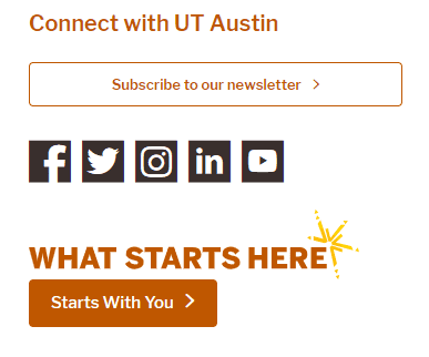
- In the footer. The footer is a natural place for website users to look for additional ways to connect with a university. For example, check out how the University of Texas at Austin’s website footer includes a button to sign up for the newsletter:
Get creative when determining the best wording for your newsletter CTAs. For example, you could invite website visitors to “Join Our University’s Digital Community” or “Stay Connected with Your Alma Mater.” Use A/B testing to try different options and see which variations are most effective for driving traffic to your signup form.
4. Strengthen the blog to newsletter pipeline
Strategic content is vital to connecting with your audience and driving engagement. Utilize your email newsletter and blog strategies to maximize the quality of content your marketing team creates.
To streamline your content creation and curation efforts, ensure your content reaches the widest possible audience, feature internal an external blog content in your newsletter, and newsletter content on your blog.
For example, you want to recap a recent alumni event to inspire alums to sign up for future experiences. You can tease the event recap on your blog, then offer a link to sign up for your newsletter to read the complete retelling. Or, you can provide the full event recap in your blog and encourage alumni to sign up for your newsletter to stay informed about future events.
Your blog and email newsletter are valuable tools for keeping your community engaged and updated on university news. Visitors will be more inclined to sign up for your newsletter when they know it will contain valuable, relevant content similar to your blog posts.
Grow and connect with your community
As always, it’s important to remember that the foundation of an effective newsletter strategy lies in recognizing and addressing your audience’s diverse needs and interests. Following these strategies, you can elevate your email newsletter into a powerful asset for cultivating relationships and fostering long-term engagement within your university community.
Whether you represent a small college or a large university, these tactics can help you maximize your website’s potential to increase newsletter signups and reinforce connections across your institution.
If you need additional guidance and direction for running A/B tests, creating CTAs, or strengthening your content strategy, contact a higher ed website design firm for support. These professionals can help research your audience, enhance your content approach based on your engagement goals, and design streamlined user journeys for every audience member.


